The fastest way to understand a month is to see it broken down. This report answers "where did the money actually go?"
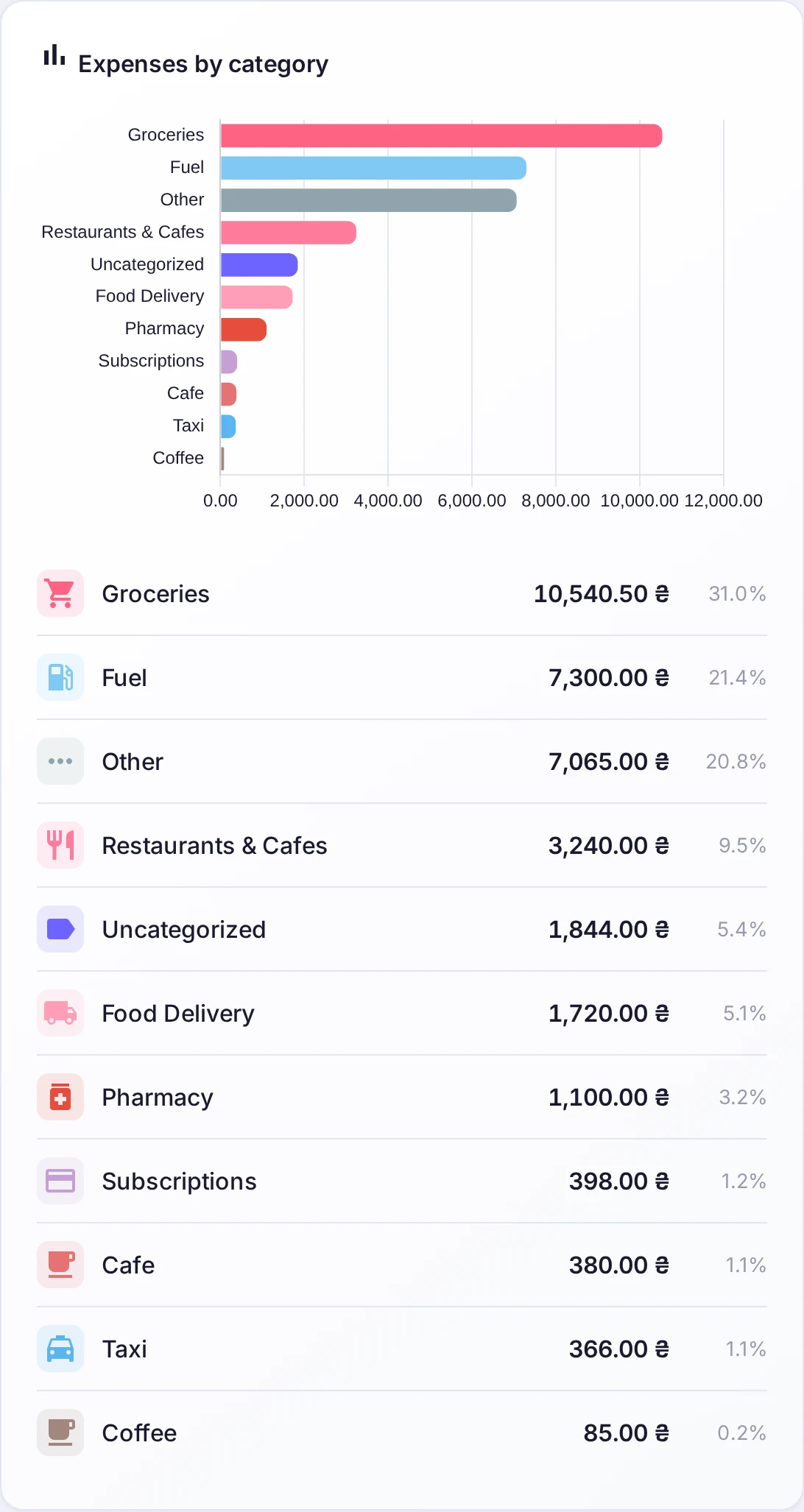
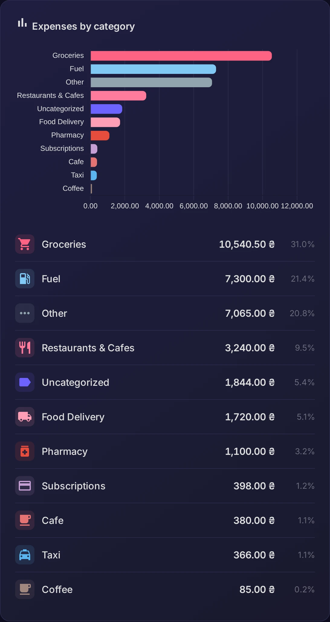
Expenses by category
The donut chart splits your spending for the period across categories — the bigger the slice, the bigger the share. It usually only takes a glance to spot the one or two categories that dominate the month.
Expenses by tag
Right beside it, the same spending is cut a different way — by tag. Because a tag can span several categories, this view answers questions a category chart can't: how much a trip cost end to end, or everything that went to a particular project.
Reading it together
Categories tell you the kind of spending; tags tell you the context. Looked at side by side they explain not just what you spent on, but why — which is exactly what you need to decide what to trim.