Beyond the core charts, analytics keeps a set of extra views for when you want to dig further.
Top expenses
A plain list of your largest single transactions for the period. It's the quickest way to answer "what were the biggest hits?" without hunting through the full history.
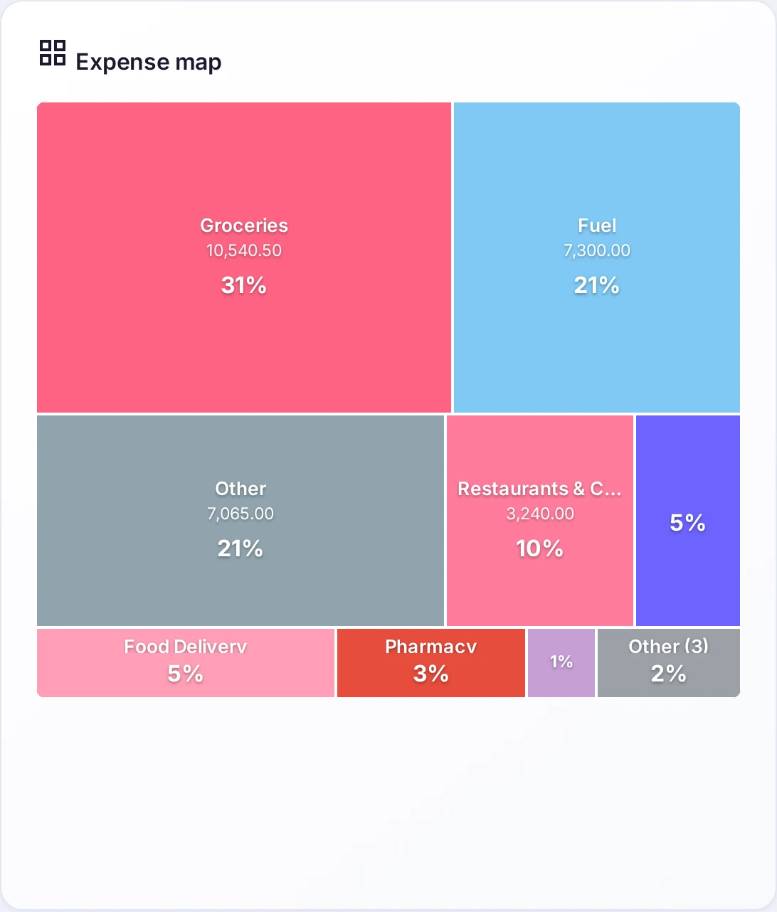
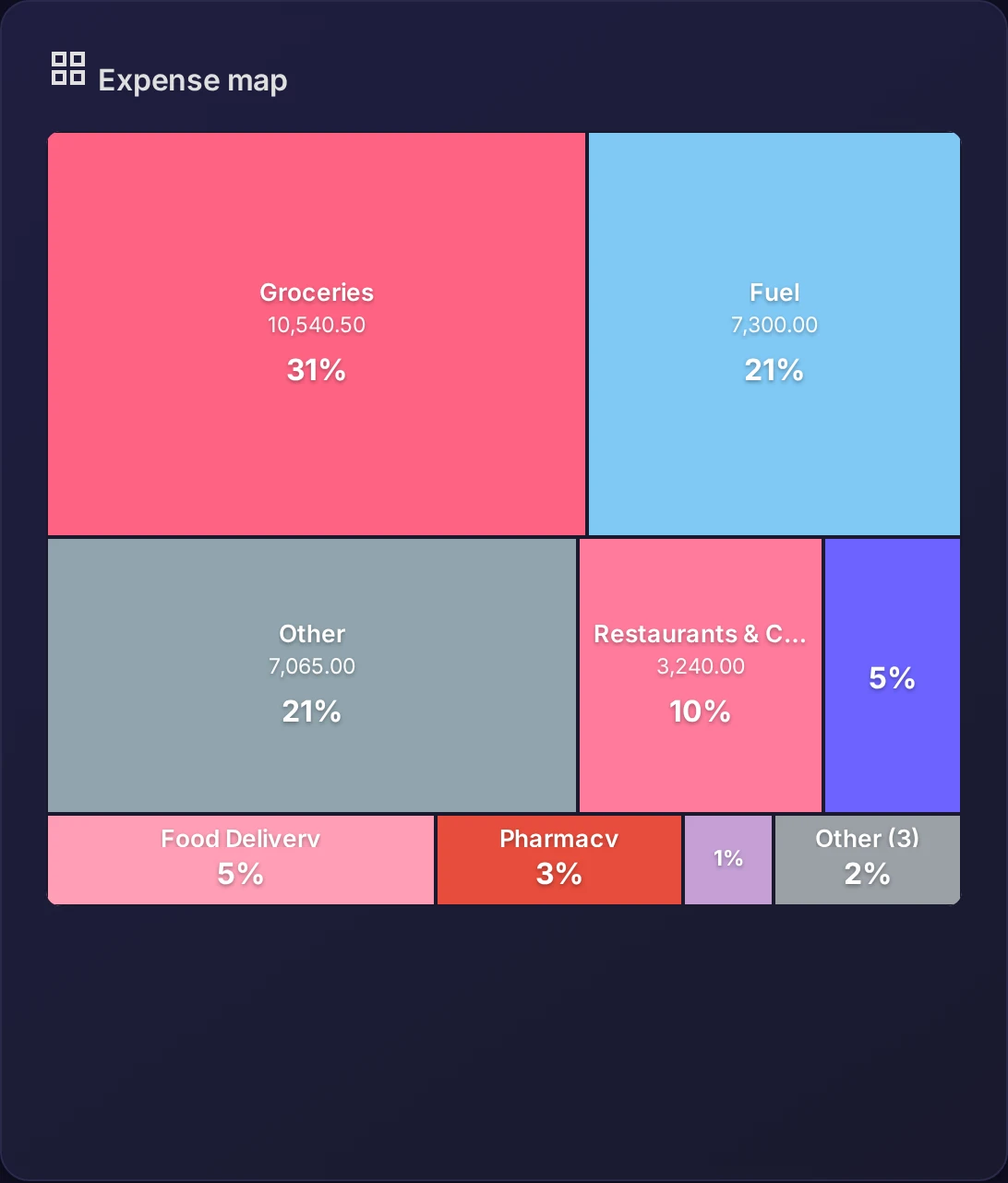
The expense map
The same category spending, laid out as a map of tiles sized by amount. It packs the whole picture into one dense view where the heavy categories are simply the largest tiles.
Activity heatmap
A calendar where each day is shaded by how much you spent — darker means more. Patterns jump out: heavy weekends, the quiet middle of the month, the pay-day spike.
Forward-looking KPIs
A set of forward metrics that summarize where your finances are heading rather than where they've been. These forward KPIs are part of Pro; the rest of the views here are available to everyone.