Analytics is where your transactions turn into a picture. This is a short map of the screen; each report below has its own article.
Pick a period
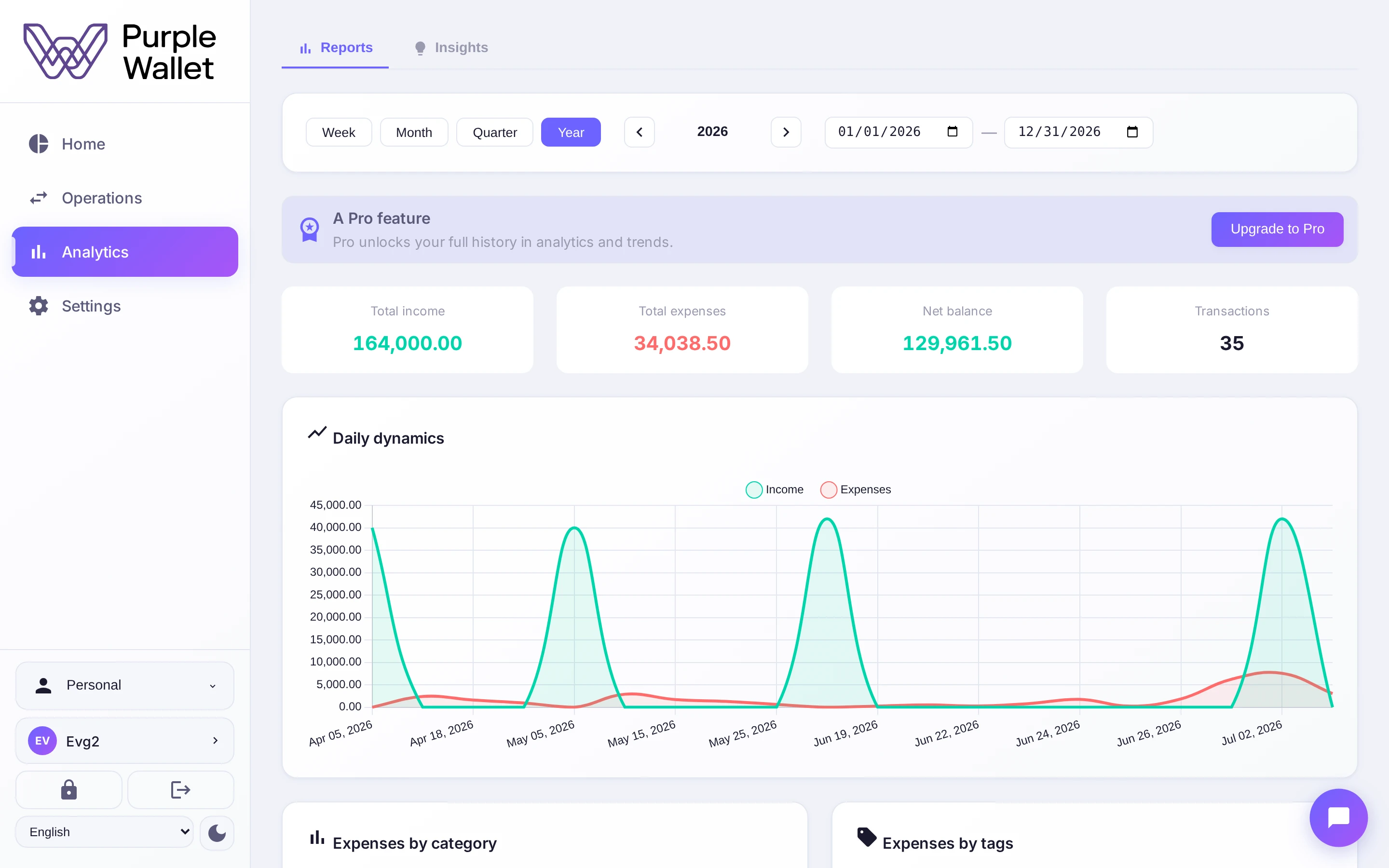
Everything on the screen is drawn for the period you choose at the top — this month, a quarter, a year or a custom range. Change the period and every chart redraws.
The summary
Up top sits a summary for the period: total income, total expenses, the net balance and the number of transactions — the headline numbers before you look closer.
The reports
Below the summary the reports unfold:
- Categories — where the money goes, by category and by tag.
- Dynamics — income versus expenses over time, and the balance trend.
- Profit and loss — the bottom line and a comparison with another period.
- More metrics — top expenses, the expense map and the activity heatmap.
Alongside the reports, the Insights tab collects what Finn has noticed. On the free plan analytics shows the last three months of history; Pro opens the full history.